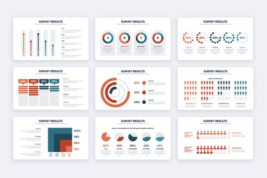
In the realm of data-driven decision-making, the survey results presentation holds a crucial role. Beyond mere numbers and statistics, these presentations serve as narratives that unveil insights, trends, and potential avenues for action.
Howerever, the big concern is how to describe survey results in a way that everyone can understand instantly without a boring look. Here comes out with a new way of presenting survey results with interactive presentation tools.

Table of Contents
Why is Survey Result Presentation Important?
If you think a survey result presentation shouldn’t be a dry recitation of statistics and figures, you’re absolutely right. It should be a dynamic storytelling experience that captivates and engages your audience, turning data into actionable insights and compelling narratives.
One of the most crucial aspects of survey result presentation is it often highlights areas of concern or areas ripe for improvement within an organization. By identifying problems and challenges clearly and straightforwardly, organizations can develop targeted strategies and interventions to address them effectively.
More importantly, it serves as a means of communication, allowing researchers to effectively convey complex findings to a diverse audience. By presenting data in a clear, concise, and visually engaging manner, presenters facilitate understanding and engagement among stakeholders.
How Do You Show Survey Results in a Presentation?

There are a range of ways to display survey results in a slide that ensure the audience understands and engages. To optimize survey results presentations, you can follows these examples:
Use a Graph or Chart
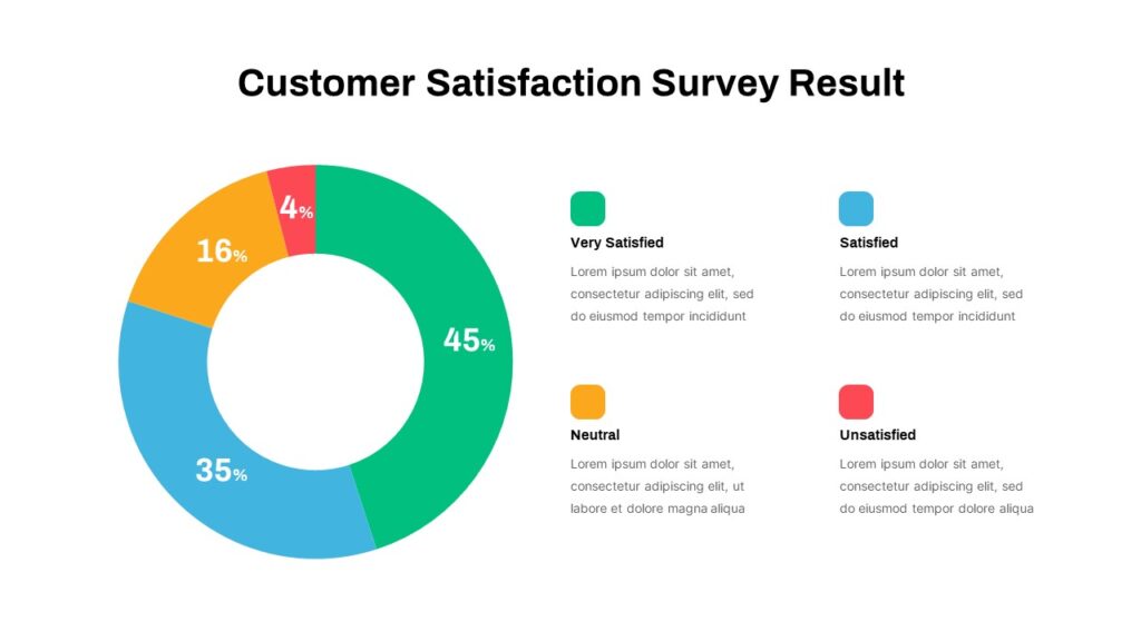
Visual representations such as bar graphs, pie charts, and line graphs can help convey survey data in a clear and concise manner. Choose the most appropriate type of graph or chart based on the nature of your data and the insights you want to highlight.
Create a Data Table
In addition to graphical representations, consider including a data table that provides a detailed breakdown of survey responses. This can be particularly useful for presenting numerical data or comparing responses across different groups or categories.
Use Interactive Clickable Results
It is also essential to add interactive elements into your presentation that allow viewers to explore survey results in more depth. For example, you could create clickable charts or graphs that reveal additional information or insights when clicked on, providing a more engaging and interactive experience for the audience.
Apply Animations
Don’t forget to add some fun to boring data by utilizing animations sparingly to enhance the visual appeal of your presentation and draw attention to key points or trends in the survey data. Animations can help guide the viewer’s focus and make complex information easier to understand.
Highlight data
Do emphasize the most important or interesting survey findings by using techniques such as bolding, color-coding, or larger font sizes. It is the quickest way to direct the audience’s attention to the most relevant data points or trends to ensure they don’t get lost in the details.
Avoid Jumbled Charts
If you don’t want to overwhelm the audience, try to focus on using simple, easy-to-read charts that highlight key insights and trends in one slide. By keeping your charts clean and uncluttered, you can ensure that your audience can easily grasp the survey results without getting lost in a sea of information.
5 Best Survey Results Presentation Tools
How do you turn survey results into a good presentation? It is where data is organized into meaningful categories, visually appealing visuals, and easy to understand. To save your time in dealing with survey results presentation, we suggest some best real-time survey tools.

#1. AhaSlides
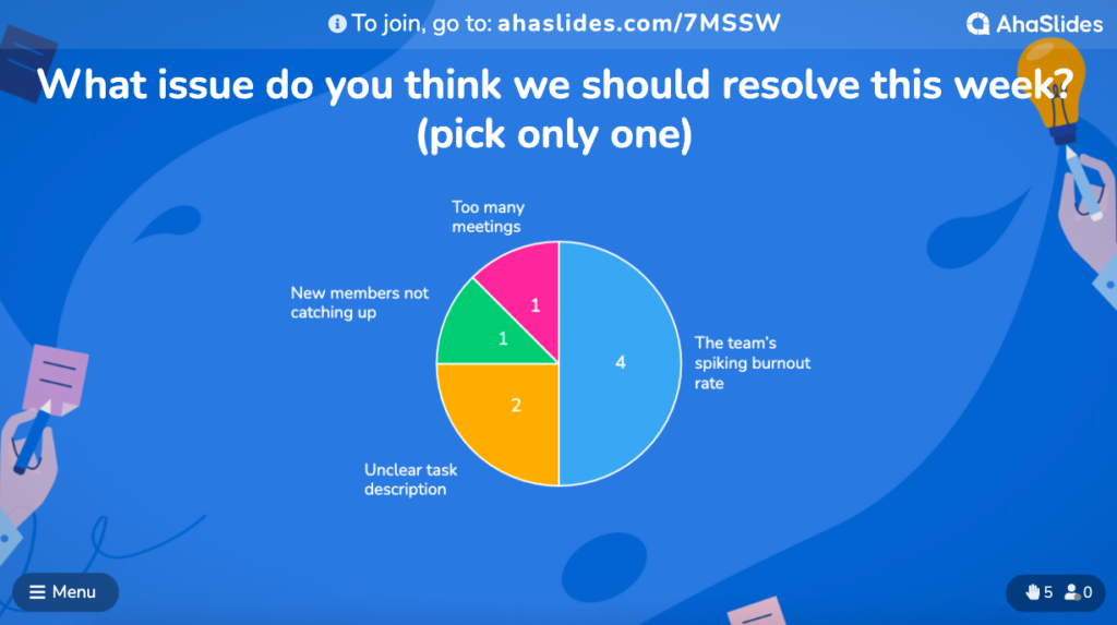
You can easily and quickly create a compelling survey result presentation with AhaSlides, the leading survey platforms for events. With response tracking function and analysis feature, AhaSlides allows you to gather valuable insights and visualize survey data in real-time, then having a space to discuss with each other for further data analysis.
#2. Mentimeter
Mentimeter is another powerful tool for presenting survey results. With its user-friendly interface and thousands of ready-to-use templates, Mentimeter allows presenters to showcase survey data in a visually stunning way.
#3. ClassPoint
You also can consider ClassPoint, an inclusive add-in for Microsoft PowerPoint that enables presenters to enhance their data presentations with interactive elements. With ClassPoint, presenters can seamlessly integrate survey results into their PowerPoint slides, creating a cohesive and engaging presentation experience.
#4. Poll Everywhere
Another popular poling platform, Poll Everywhere allows presenters to present real-time survey results for their audience. With its intuitive interface and customizable options, Poll Everywhere makes it easy to create interactive surveys and incorporate survey results into presentations.
#5. DirectPoll
DirectPoll is a simple yet effective tool for creating interactive polls and surveys with instant feedback responses analysis. With its straightforward interface and real-time response tracking, the app enables presenters to engage their audience and present survey results in a clear and concise manner.
Final Words
If it is well organized, data indeed tells a powerful story. By structuring your survey results presentation in a clear and logical manner, you can guide your audience through the data, helping them understand the narrative behind the numbers. Thus, using the above tips can greatly enhance the effectiveness of your presentation and ensure that your message resonates with your audience.
FAQs
How do you introduce a survey in a presentation?
One of the best methods to introduce a survey in a presentation involves providing context for the survey, explaining its purpose and objectives, and outlining the methodology used to collect data.
How to show survey results in PPT?
To show survey results in PowerPoint (PPT), presenters can use interactive elements such as charts, graphs, and tables to visually represent the data. Additionally, they can incorporate storytelling techniques to contextualize the results and highlight key findings.
Can you do a live poll in PowerPoint?
Yes, presenters can conduct live polls in PowerPoint using interactive polling tools such as ClassPoint and Poll Everywhere. These tools allow presenters to create and administer polls in real time, engaging their audience and gathering feedback instantaneously.


